Screenfly is one of the most useful online tools for web designers and CSS developers. This tool allows them to view the web page in various screen resolutions even in tablets and smart phones as well.
Test your Website on various screen sizes with Screenfly – http://quirktools.com/screenfly/
The most common situation faced by the web developers is browser compatibility and resolution problem on various computer monitors. Now a day everyone is using different type of computers with different types of screen resolutions. So it might be challenging for web developers and web designers to meet the client requirements with best view of all the screen resolutions.
So here is the solution for that. Screenfly is a web application that will help you with by doing the entire work for you. By the single system, you can view almost all kind of screen resolutions.
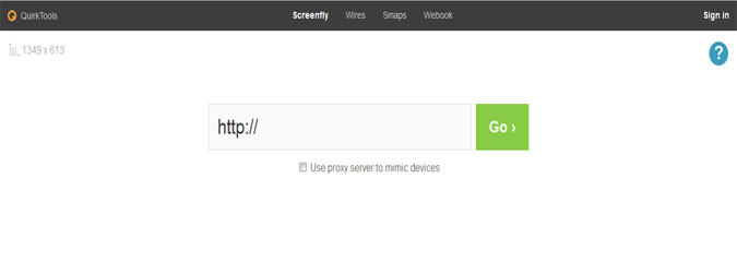
What you need to do is simple, just type in your website in the URL field, click “Go” and you’ll see how your website looks in different screen resolutions.
Input:

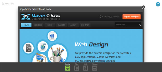
Output:-

In simple, enter a website and then select the device you want it load in from the bottom menu. You have options to view your site in desktop, mobile, tablet and TV versions. The desktop version allows you to choose the screen size from 10” notebook to a 24” desktop, you can choose to view to Apple, Samsung, Motorola and Velocity tablets. The TV version display in 480, 720p and 1080p resolutions and you can also choose to view on different mobile OS. All these include further model and screen size options. You can also choose to enable scrolling and choose to change the screen orientation from portrait to landscape. It is one of the best tools available to test your webpage without actually going for different devices.
It supports Samsung Galaxy Tab, Apple iPad 1 & 2 and Motorola Xoom tablets among others and Apple iPhone 3 & 4, Google Nexus S, LG Optimus S among other mobile screen resolutions. You can turn device detection switching off by checking the No proxy server box when you enter the URL.
Features:
• See how your website appears on different devices.
• Include computers, tablets, televisions and mobile phones.
• Enable scrolling and rotate display if desired.

